
The pathways interaction network
Although tables and tree diagrams are very helpful for visualising hierarchical information and understanding the PEA results, they do not always sufficiently represent the underlying information or relationships that exist between the KEGG pathways. Examples of this type of hidden information may include genes or metabolites shared between biological processes, belonging to the same classification of two or more pathways, or even that two or more pathways show a similar behaviour or trend at similar biological agent (gene or metabolite) concentration levels, under the same conditions.
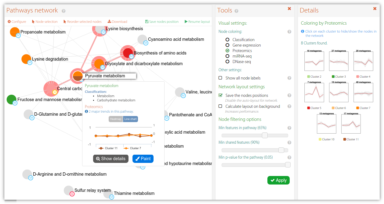
Figure 1. Example of an interactive network diagram showing pathway-pathway interactions in PaintOmics 4. Nodes represent pathways with a combined p-value lower than 0.05. In this case the node colour indicates the classification for the pathway based on the trend of the biological features for Proteomics data. Finally, an existing edge between two nodes indicates that both biological processes are closely related in biological terms, e.g. the reaction described by pathway A fires another biological process described by pathway B.
In this scenario network-based approaches become a valid option for representing such biological interactions in combination with the results obtained from the PEA. PaintOmics 4 includes an interactive network where nodes represent pathways and the existing relationships are displayed by drawing edges (Figure 1). In the current version of PaintOmics, the existence of an edge between two nodes indicates that both pathways share an important percentage of biological features, suggesting that both biological processes may be somehow related. Additional information is represented by using different visual resources, as follows: the presence of nodes in the network depends on the percentage of input biological features that participate in the biological process, as well as the p-value of the pathway enrichment table. By setting these thresholds we are able to discriminate pathways that do not contain enough input information or are significant enough to be considered by the user. The sizes for the nodes are directly proportional to the statistical significance of the represented pathway (i.e. inversely proportional to the computed p-value). Spatial arrangement for nodes is also informative. By default, PaintOmics 4 uses ForceAtlas2, a forced-direct layout algorithm that distributes the nodes based on repulsion and attraction forces until it reaches a steady-state. While all nodes are affected by repulsion forces, the attraction forces act on pairs of nodes connected by edges in proportion to the weight associated with the edge (i.e. the percentage of shared biological features). Hence, spatial distribution will likely show nodes grouped into sets of related nodes, allowing users to rapidly identify potential pathways of interest for further research. Alternatively, users can manually distribute the nodes in the pathway using the tools provided in PaintOmics 4.
Last but not least, PaintOmics 4 makes use of different approaches for colouring the nodes in order to discriminate whether a pathway belongs to a KEGG classification or follows a certain regulatory trend for the biological features involved. More specifically, after the PEA step, PaintOmics 4 calculates the major regulatory trend(s) for the features in each ranked pathway, for each omics type. The strategy adopted, implemented as an external R routine, consists of three key steps: (i) for each omics data type it evaluates the regulatory profile of the biological features in different conditions or samples, based on the method proposed by Nueda et al. Essentially, the strategy applies PCA to the data matrices and obtains a set of "synthetic genes", also called metagenes, that depict the most representative regulation patterns for each pathway, (ii) it then clusters the resulting profiles and groups the pathways based on similar behaviour for each omics data type (iii), and finally it assigns colours to the different clusters and renders the nodes in the network accordingly. The optimal number of clusters is calculated automatically using the average silhouette approach, although a fixed number can also be specified by the user. The silhouette of an observation is a measure of how similar it is to its own cluster, compared to the other clusters (ranging from -1 to 1), providing an appreciation of the relative quality of the clusters. Obtaining the average silhouette of observations for different values of k, it is possible to determine the optimal number of clusters k, as the one that maximizes the average silhouette. After that, users can switch the rendering strategy for the network by choosing the omics type they are interested in. Figure 2 shows an example of a network painted using 2 different approaches: colouring by classification (A) and colouring by RNA-seq trends (B). Finally, is important to note that each node in the network is extended with a pop-up showing the pathway trend (for the chosen omics type, Figure 3-A), as well as a supplementary panel summarizing the trends for each cluster (Figure 3-B) and an advanced view showing the trends for each omics type for a chosen pathway (Figure 3-C). This tool introduces a valuable characteristic to the application: researchers can easily switch between the different complexity levels in the biological system of interest, moving from the pathway network to the single pathway level and, from there, down to the level of individual genes, with a single mouse click.
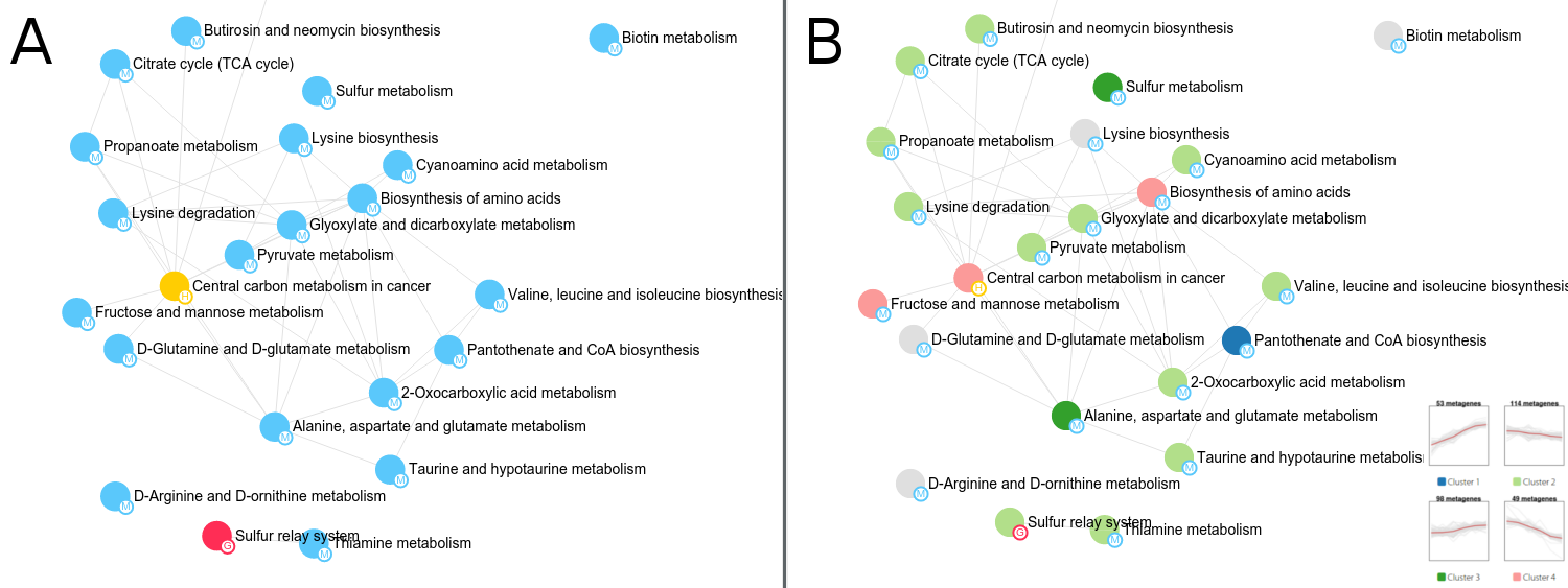
Figure 2. Example of three different approaches for node colouring systems in PaintOmics 4. Rendering by pathway classification (A) and by RNA-seq trends (B).
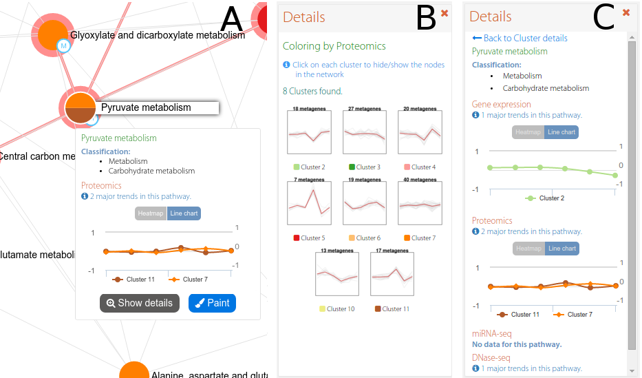
Figure 3. An example of an interactive network in PaintOmics 4. The interactive network panel (A) is complemented by a secondary panel which shows the trends for all the clusters in a given omics type (B), or the trends for each omics type for a chosen pathway (C).