
Multi-omic pathway-based visualisation
One of the core features of PaintOmics 4 is that it allows individual KEGG pathways to be studied in combination with user input data. After filtering the initial set of pathways based on their classification and/or behaviour criteria, users can then explore the pathways. Figure 1 illustrates an example of the typical workspace for pathway exploration. An important decision when designing visualisation tools is the layout of the application as it should be able to exploit the space available in the window, which is often limited by the size of the screen. Such limitations in the usable space usually result in restrictions in the displayable data (e.g. only being able to use a single view at a time), which become a hurdle for analysing and comparing information. In contrast, overuse of simultaneous views may become confusing and thus dramatically reduce user-friendliness.
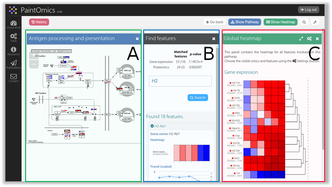
Figure 1. Example of a workspace for pathway exploration in PaintOmics 4. The layout for pathway exploration is divided into three panels. The main panel (A) contains the interactive pathway diagram, the auxiliary panel (B) shows some useful tools for analysis, and the secondary panel (C) contains information complementary to the KEGG diagram.
Considering the characteristics described above, the layout for the pathway exploration section was divided into three simultaneous, closable, resizable, and window-based panels which allow users to visualise the optimal amount of information they require to conduct their research. The main panel (Figure 1-A) contains an interactive diagram representing the KEGG pathway combined with the input data. As mentioned in previous sections, several graphical resources are used for pathway diagrams, for example, boxes to represent gene products, circles for chemical compounds, etc. Results from previous steps in PaintOmics which supply input data (omics measurements) are mapped to KEGG biological features (genes and metabolites). Consequently, users can easily navigate through the diagram and visualise the different values associated with each biological feature. As depicted in Figure 2-A, for each matched feature, a gridded box is overlaid on the KEGG image which shows an equal number of sections to the number of columns present in the input files, and as many rows as there are omics data-types supplied (this option is configurable by the user), unless there are multiple features from the same omic matching to the same gene (i.e. multiple miRNAs) in which a case more rows are shown. Each section is coloured using as a heatmap approach, according to the corresponding ratio of the expression or concentration value. By default, the 10th and 90th percentiles of the ratio values determine the min and max tonalities used for heatmaps, thus preventing incorrect colouring due to the presence of outliers, but the colouring options can be modified from the "Settings" panel. Additionally, any biological features considered as significant for any of the omics data types (based on the input data), are highlighted by a thicker border and a special mark at the top right corner. This approach helps users to get an at-a-glance overview of the behaviour of all the biological features involved in the biological process of interest in the different conditions analysed.
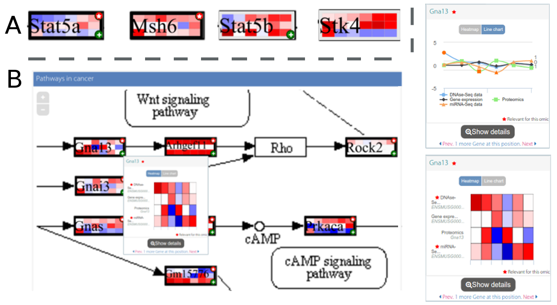
Figure 2. Heatmaps in PaintOmics 4. (A) - Concentration values for the features in the pathway are represented using heatmaps. (B) - When the user hovers the mouse over a heatmap box in the diagram, PaintOmics shows a floating panel with an interactive heatmap or a line chart depicting the concentration values for all the omics data types for the different conditions in the experiment.
As part of the interactivity of the diagram, users can hover the mouse over the biological features to get extended views of the feature values as an interactive heatmap (by default in blue-white-red scale, where blue indicates downregulation and red represents upregulation) or as a line chart depicting the expression or concentration trend for all the omics data types for the different conditions in the experiment (Figure 2-B); there can be multiple views in the window, provided the user enables the sticky flag or drags them to another place. It is noteworthy that features that share functions or somehow both contribute equally to the biological process will also share the position in the diagram (i.e. a single box can represent one or more biological features). For these sets of features (designated as feature families), by default the gridded box shows the values for the most significant features in the set (namely, the feature most frequently marked as significant for the uploaded omics types) and the existence of hidden features is indicated by a special mark in the bottom right corner (Figure 2-A). Using the extended view, users can switch between the features in the set and change the feature drawn in the diagram. In a secondary panel (Figure 1-C) users can find complementary information for the KEGG diagram. This panel shows a detailed view of feature families or individual features, including links to external databases or resources and charts describing the behaviour of the features for each supplied omics type (Figure 3-A). Alternatively, users can visualise a set of heatmaps that provide a global idea of the concentration levels for all the features involved in the biological process on this panel (Figure 3-B). Finally, an auxiliary panel (Figure 1-B) provides access to useful tools such as a search panel for quickly locating features in the pathway and a settings panel that offers several options for adjusting the visualisation to the user's requirements.
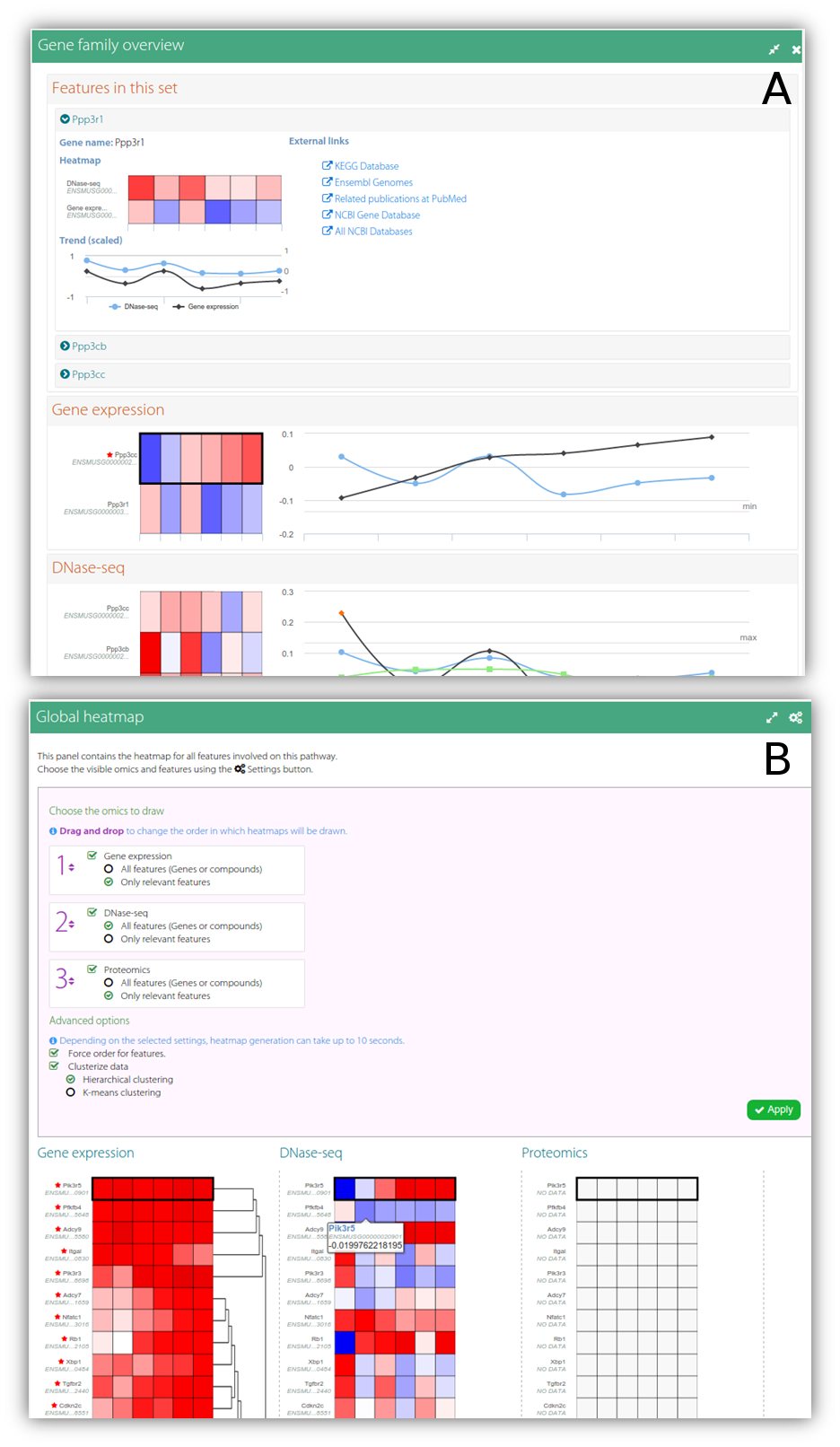
Figure 3. Example of a secondary panel for pathway visualisation. (A) - Using this panel, users can visualise the concentration values for the features in a feature family together, grouped by omics type. (B) - Alternatively, this panel can be also used to inspect the concentration values for all the features that participate in the biological process, grouped by omics type. These global heatmaps can be customised by the user by applying different clustering methods, by forcing the order of the features, or by choosing between showing all or just a subset of the relevant features for each omics data type.